Brand Identity for a Lingerie Boutique in Montrose
Next to You
Next to You is a lingerie boutique in Montrose built around something much bigger than simply selling bras. It’s about expert fitting, genuine care and helping women feel comfortable and confident through every stage of life.
The new brand identity needed to reflect that personal experience while giving the business a more modern, polished look that could grow confidently across the shop, social media and wider marketing.
The Brief
Next to You serves women of different ages, body shapes and stages of life, so the brand needed to feel welcoming and inclusive without becoming overly feminine, clinical or dated.
The challenge was finding the balance between expertise and approachability. It needed to feel established and trustworthy enough for customers to feel comfortable asking for help, while still having personality, style and a sense of quality.
Rather than focusing purely on lingerie, the identity needed to represent the experience behind the business: personal service, proper fitting and having someone in your corner as your needs change.
The Brand Direction
The creative direction combines a refined, premium feel with warmer, more playful details, creating an identity that feels considered without becoming too serious.
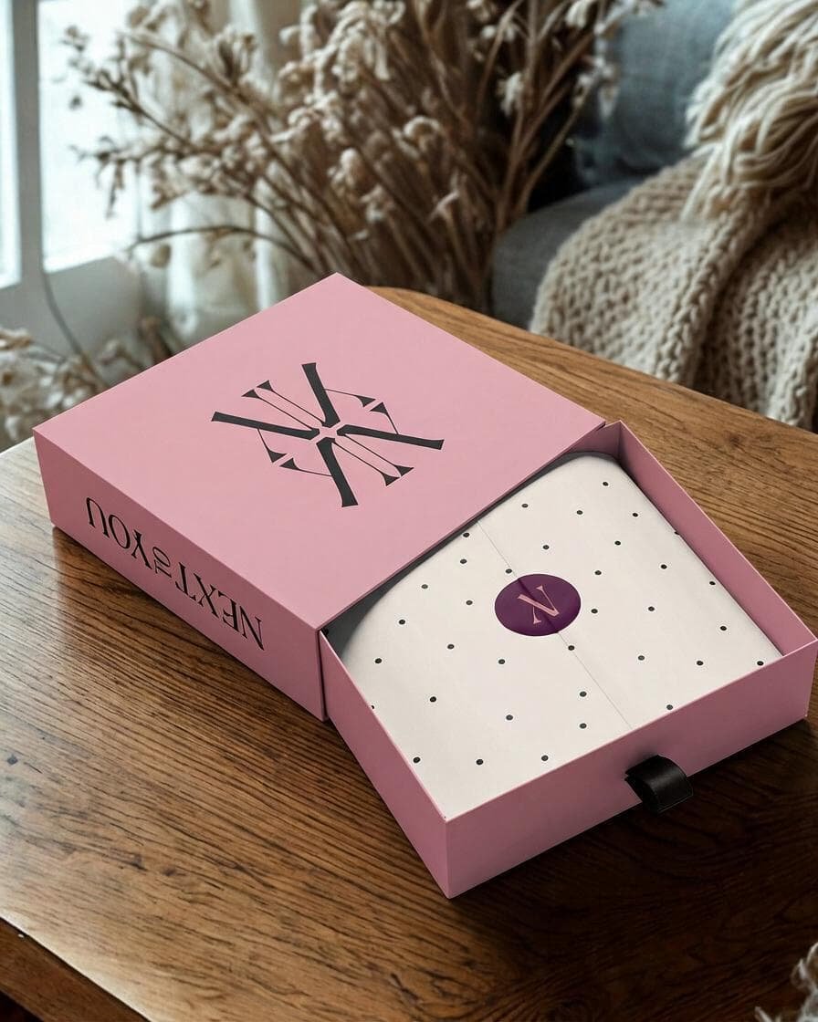
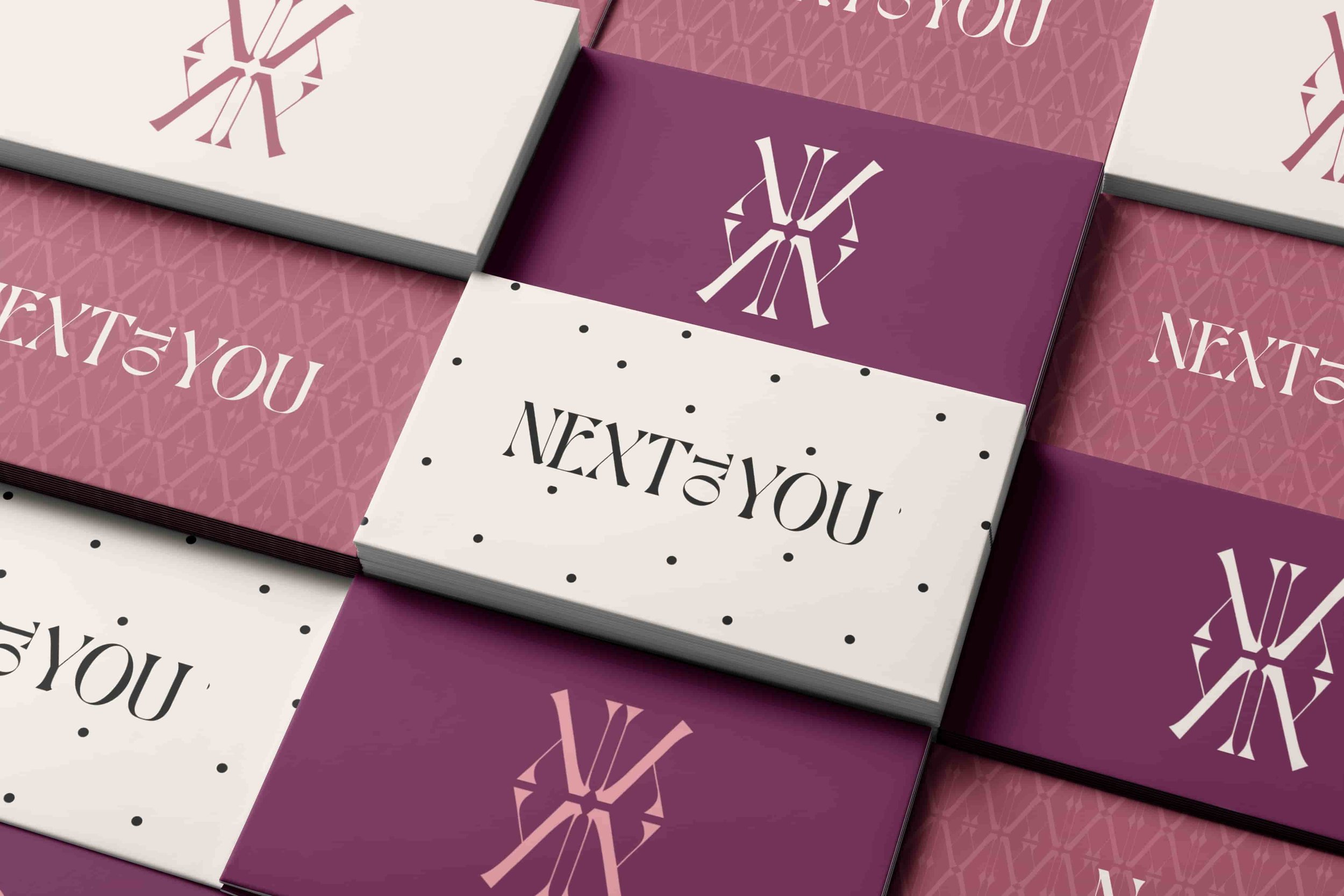
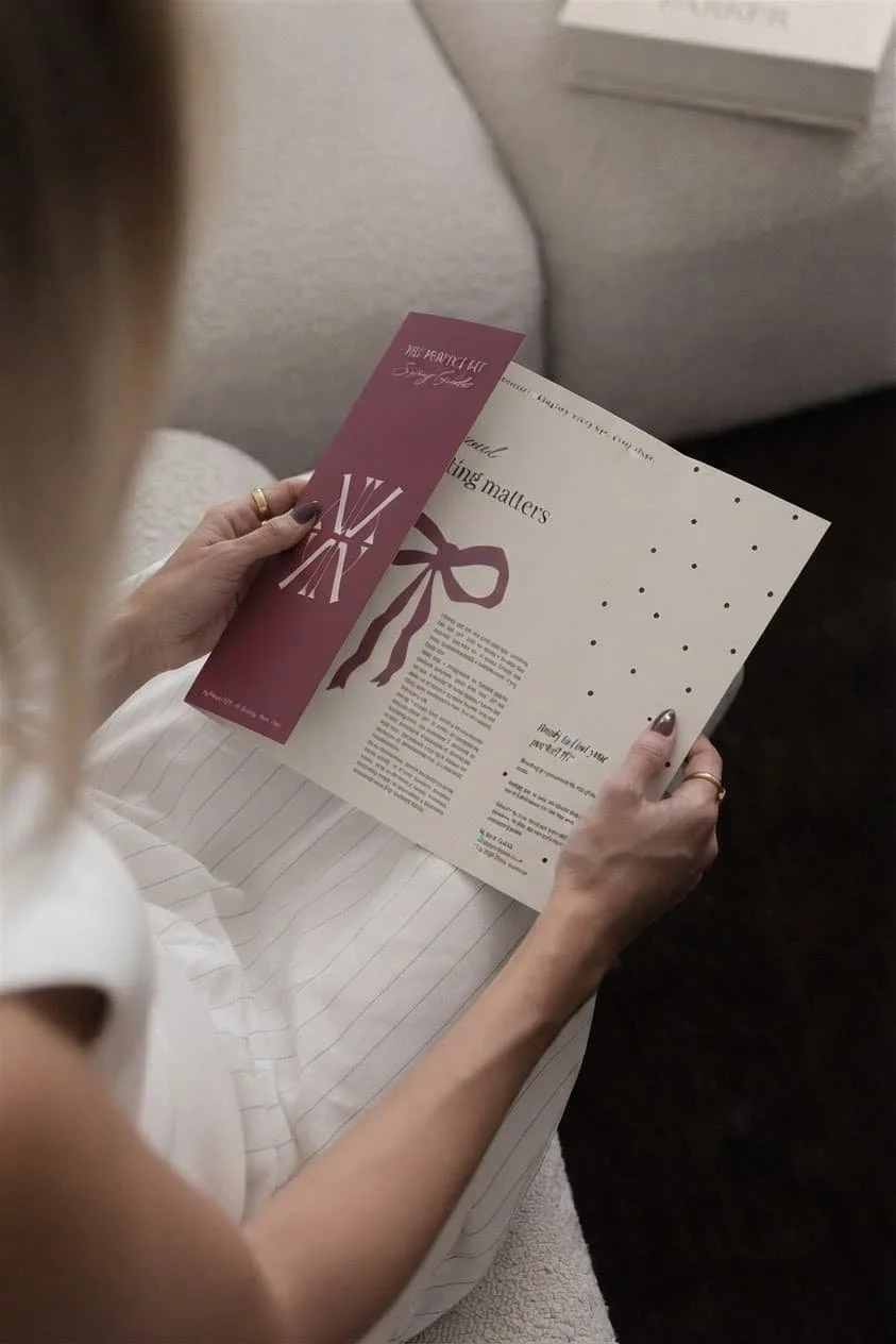
The logo suite was designed to give Next to You flexibility across different applications, supported by a monogram that became a key part of the wider visual identity.
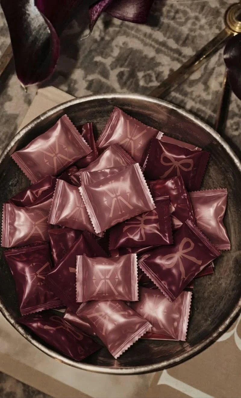
That monogram was developed into a bespoke repeating brand pattern, creating something recognisable that can be used across packaging, social media, printed materials and in-store details. A more playful polka dot pattern adds another layer to the identity and gives the brand the option to dial the personality up or down depending on where it appears.
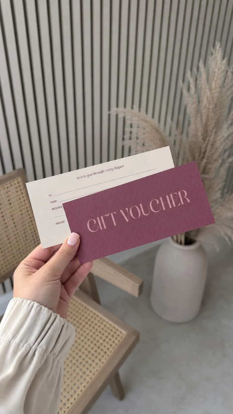
Typography also plays an important role, balancing clear, easy-to-read type with a more decorative highlight font used sparingly for short callouts and details.
“The perfect fit for every chapter”
The tagline goes beyond finding the right bra size.
Women’s bodies and needs change throughout life, from different ages and stages to pregnancy, motherhood and everything in between. “The perfect fit for every chapter” captures the idea that Next to You is there throughout those changes, offering expertise, support and a fitting experience that feels personal.
What I Created
The finished Next to You brand identity includes:
Primary logo
Secondary logo
Monogram
Colour palette
Typography system
Bespoke monogram brand pattern
Supporting polka dot pattern
Brand application examples and mockups
Together, these elements create a flexible visual system rather than just a logo, giving the business plenty to work with across both digital and physical touchpoints.
The Result
Next to You now has a brand identity that reflects the quality and care behind the business while still feeling modern, warm and full of personality.
The wider brand system means the identity can stay consistent whether it’s appearing on an Instagram post, printed fitting guide, packaging, signage or throughout the shop itself.
Most importantly, it gives Next to You a visual identity that feels capable of supporting the business as it grows, while keeping the personal, reassuring experience at the heart of the brand.
Thinking your branding might be ready for its next chapter?
You don’t need to know exactly what your new brand should look like before you get in touch. That’s kinda my job.
If your business has grown but your branding hasn’t quite caught up yet, I’d love to hear what you’re working with and where you want to take it next.